The Effortless Reading Dilemma
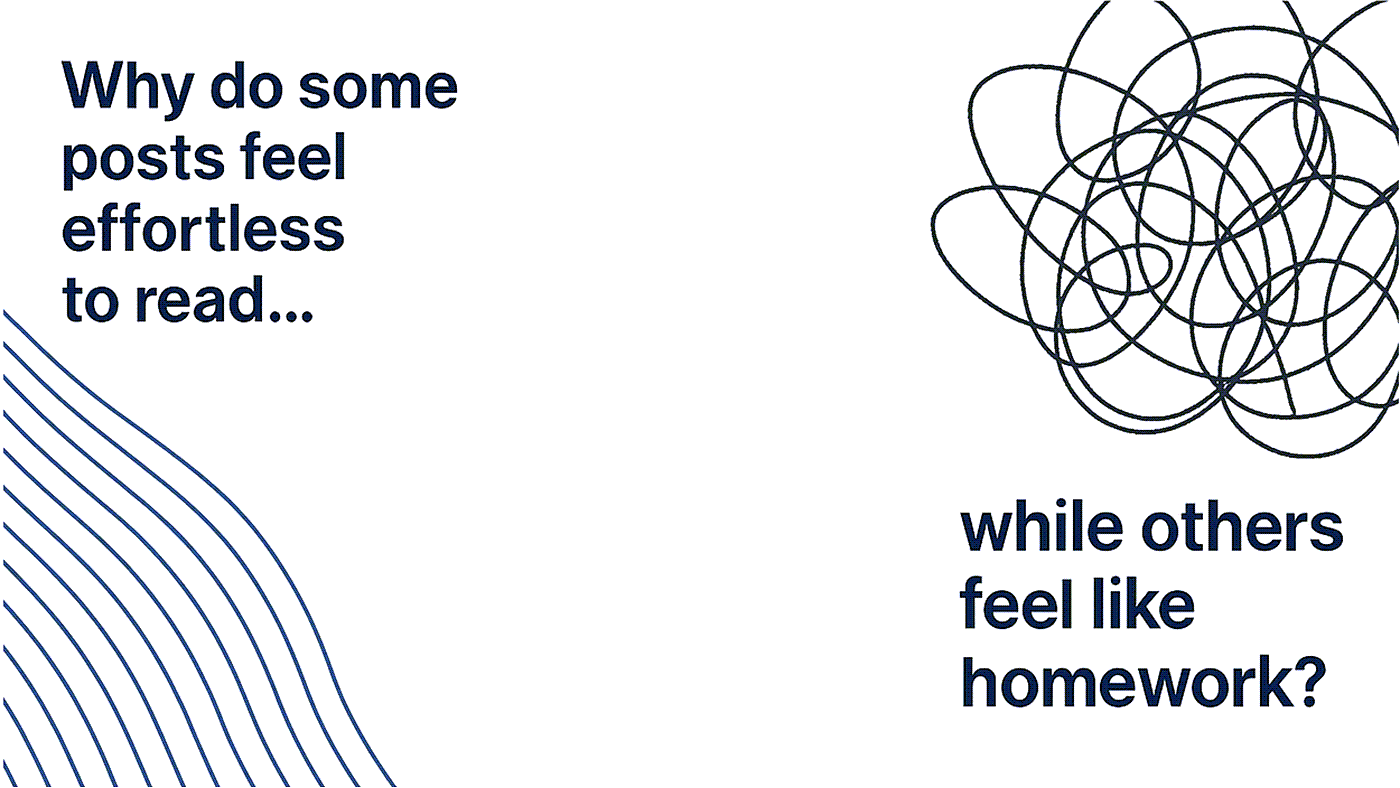
Why do some posts feel effortless to read…
while others feel like homework?
It is not the words. Those went through iterations with help of colleagues and / or on LLMs. You built your story. But now, how do get your audience to read it?
It’s the styling. You styling is limited by the editor on social sites.
You want to make the reader’s eye move, guide their attention, build a rhythm, and land an impact. When styling works, it doesn’t just “look pretty.” It makes your story unforgettable.
Here’s the difference:
🚫 Bad styling
Random fancy fonts
Emojis sprayed like confetti
Walls of text dressed up, but still dull
✅ Effective styling
🔹 Anchors → Bullets to guide the skim-reader
🔹 Flow → Line breaks that create pace, not clutter
🔹 Punch → Visual contrast that makes the lines stick
🔹 Hierarchy → Bold or symbols to spotlight the ideas
Think of it this way:
👉 Plain text is radio.
👉 Styled text is video.
The message might be the same:
but one has layers that keep people watching.
On LinkedIn and quite a few other social sites too, styling is the stage lighting that makes the star — your content, shine brighter.
Not all social sites have formatting text. So what are your options? You can use the images, videos, or carousals, which are in vogue. For your text, make use of freely available LinkedIn formatting tools that not only work for LinkedIn posts but also usable on other social media outlets.
Ready to create scroll-stopping LinkedIn posts?
Try our free LinkedIn Post Formatter with live preview
Try the Formatter